Brief
Roop Family Foundation was founded in 2006 with the passion to help Christian charities. They have touched the lives of many by fiscally supporting projects in their community. Roop founders came to Jordan Crown wanting them to create a responsive website to be a hub of information including webinars and podcasts for people facing hard issues such as teen pregnancy, homelessness, abuse and bullying. Jordan Crown employed my help to update their logo to be more unique, modern and appealing to both teenagers and adults alike. So off we go.
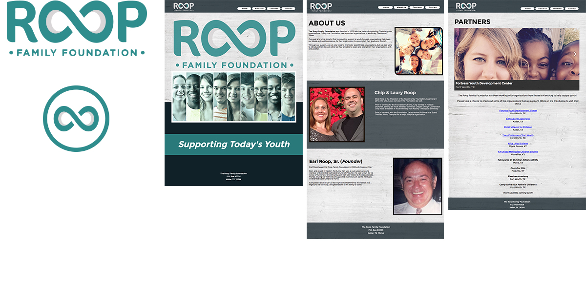
Original logo and website
Roop Foundation was ready to take their organization to the next level with sponsored events and youth activities. Their website was looking dated so they employed Jordan Crown to design their new responsive site. Roop also knew they needed to create an identity that was more appealing to youth, was more unique and wearable. Jordan Crown sourced me to help them with the task.
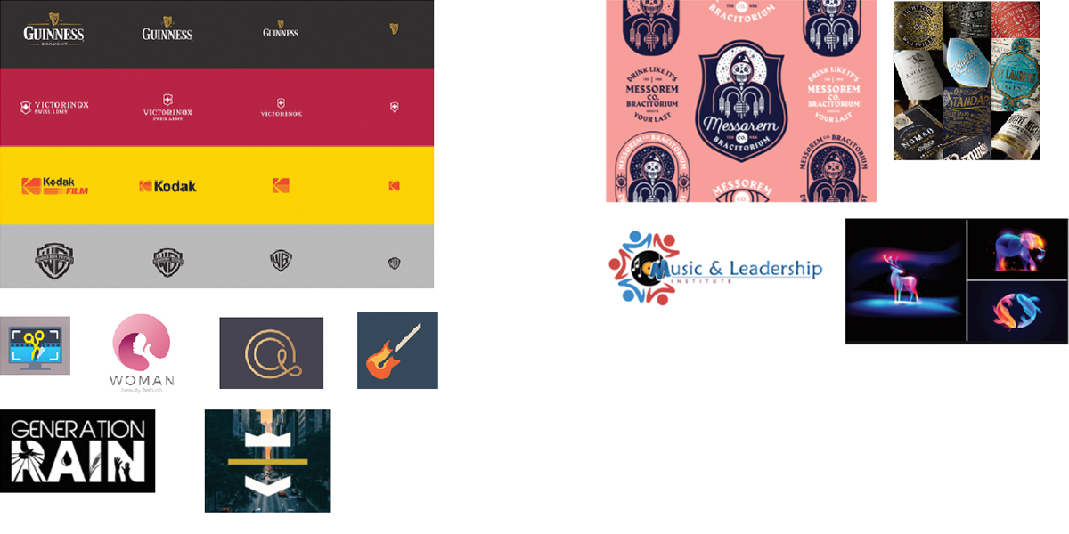
Logo Activity
When I engage with a client I ask them discovery questions and participate in a logo activity. I ask them to find 5 logos they love and connect with from a business perspective and tell me why then I ask them the same for logos they dislike. I learn a lot about the client and what they are looking for with this engagement.
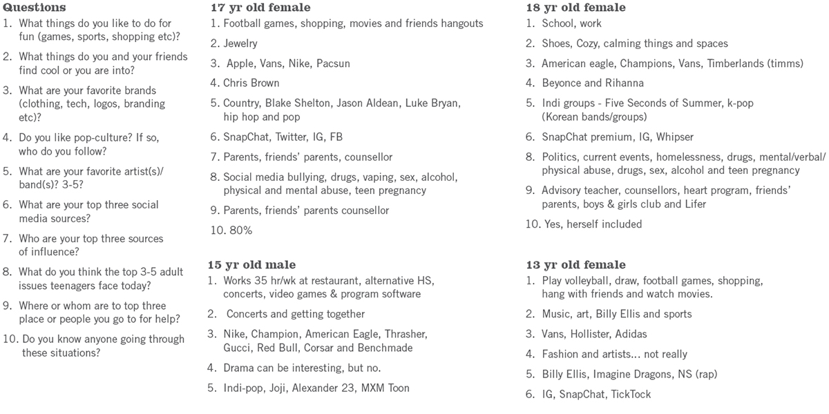
Youth Interviews
Because our focus is teenagers and I am certainly out of the loop with them. I felt like I needed to conduct interviews with youth between 12 – 18 year olds. I got permission from their parents and ask questions around brands and music preferences as well as some of the issues they face in school. My findings were fascinating!
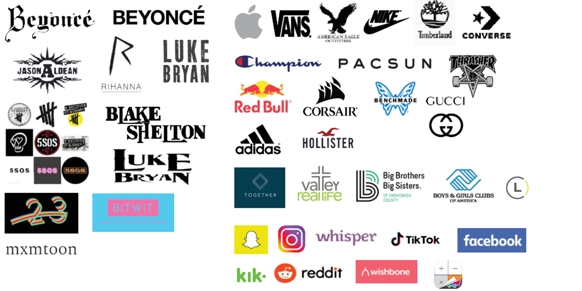
Competitive analysis
Here is a logo snapshot of their interests in clothing, technology, social media influences and music brands.
Research
Since I was designing a logo for a charity foundation, I felt I needed to explore other similar organizations to get a feel for the landscape.
Rock Band Research
Since our youth and the founder have a passion for music; I wanted to look at popular rock band logos as inspiration.
Christian Rock Bands
Because the foundation is rooted in Christian morals; I wanted to get inspired by some of the band logos that are popular with that religion.
Youth groups and symbols
I also wanted to take a peek at youth group and ministry logos and Christian symbols for inspiration. The founder mentioned that it might be interesting to see a subtle hint to their religion but wasn’t a requirement.
Words that inspire
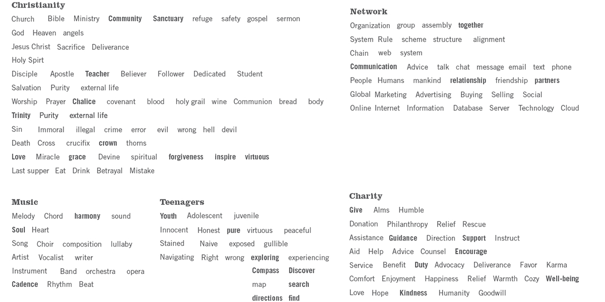
Words can inspire your imagination. I like to play this visualization technique to spark ideas and creative concepts.
Logo inspiration
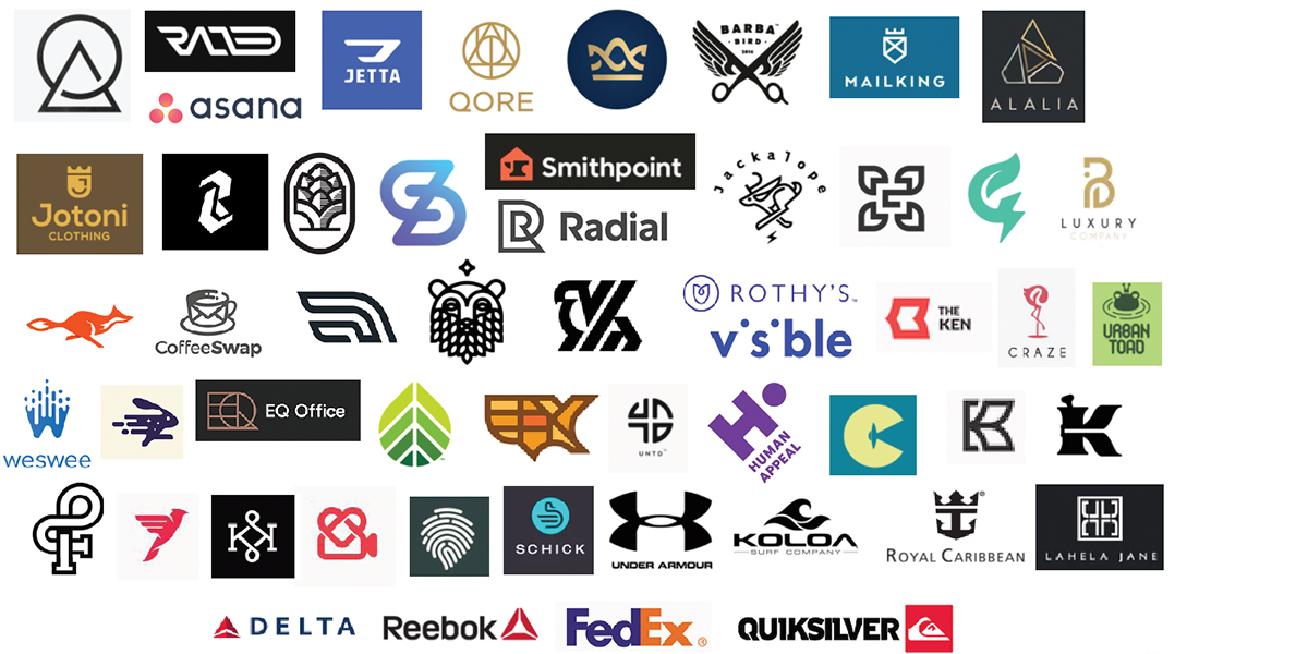
Here are some logos that inspired me.
Icons that inspire
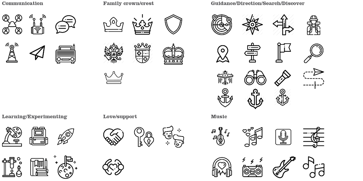
I took words and applied icons to spark logo ideas, then try to put them together.
Sketches
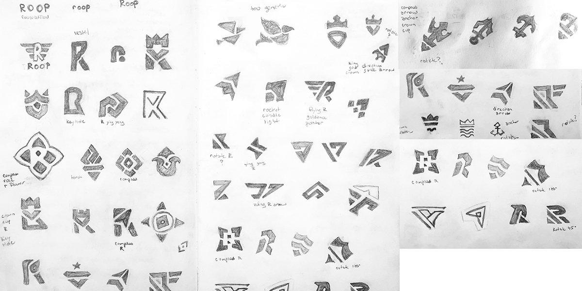
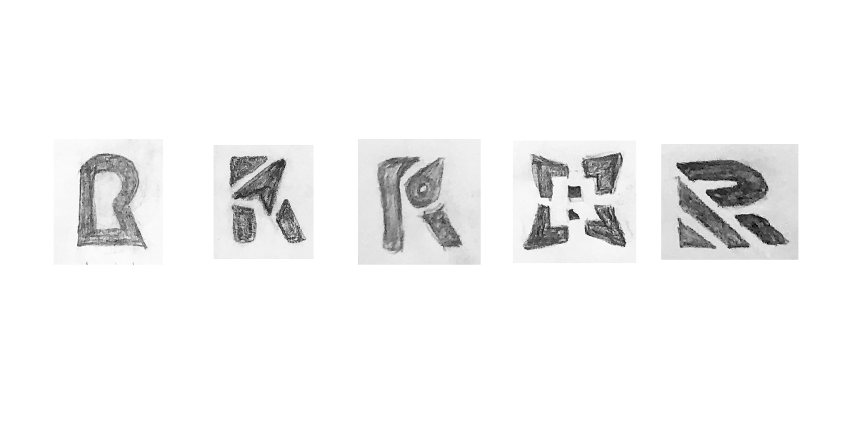
Since this logo needs to be wearable I started with the symbol. For me the symbol inspires the wordmark font choice.
Sketch selections
A few more than I like to take into the black and white digital round but the client was happy with many of the sketches I came up with.
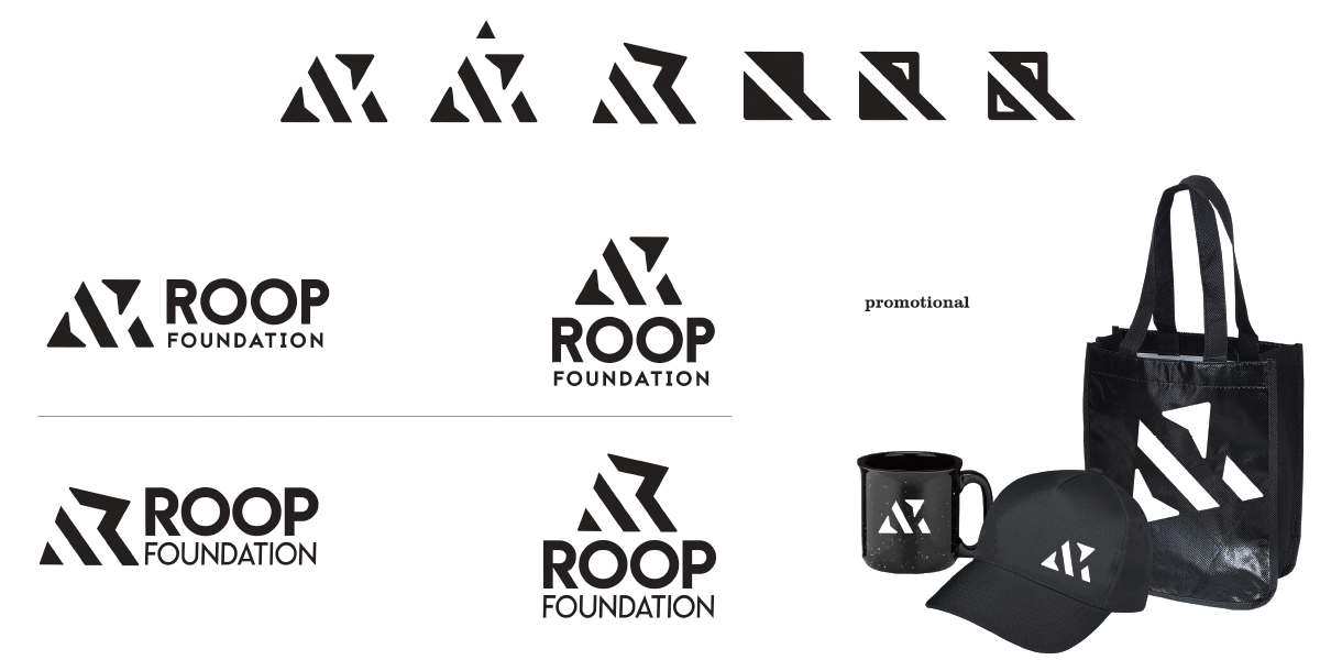
Concept 1
My personal choice. I again decided to showed the client how I pushed the idea. This logo is inspired by sports, the trinity and compass direction.
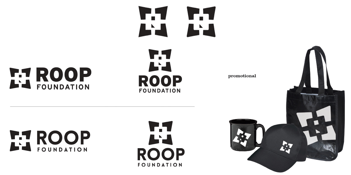
Concept 2
This concept was inspired by the compass rose and how Roop provides that guidance to youth. I wanted to see how I could combine the “R” into the center.
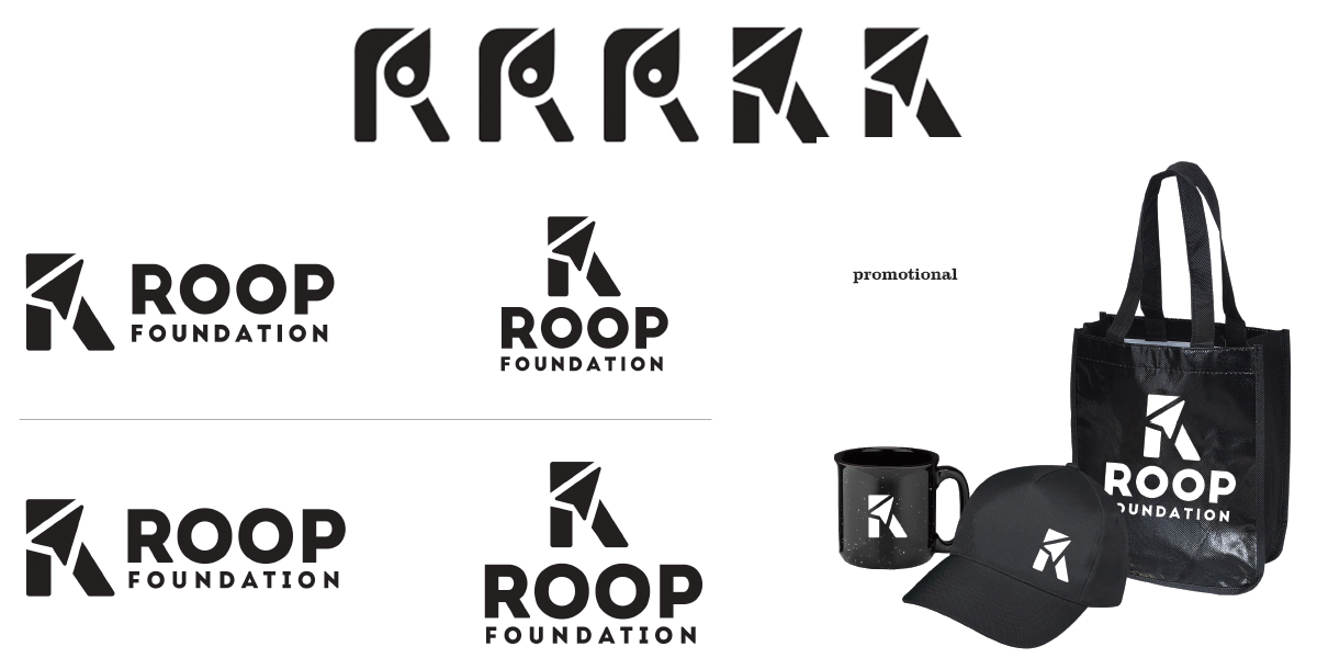
Concept 3
This concept is inspired by the R and a compass arrow. The founders really liked this direction.
Concept 4 & 5
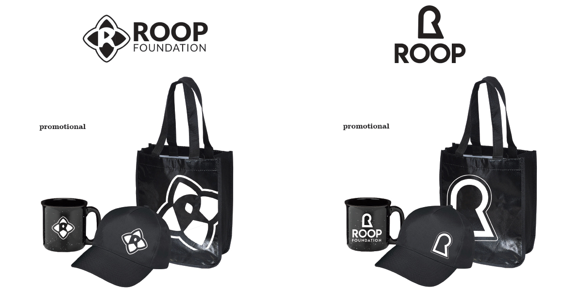
Another compass rose and keyhole ideas.
Social Survey
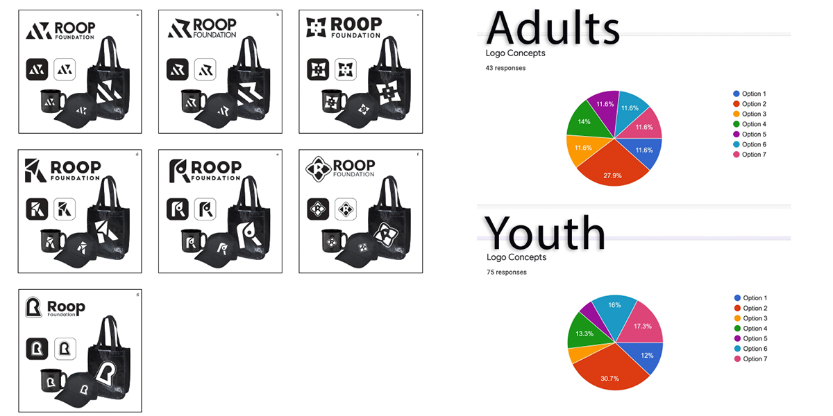
I suggested we try a social survey to our target demographics to help the founders decide which concept to choose. We surveyed adults who might be submitting their charity project for funding and youth who will gain valuable resources from them. The results were educational.
Color Palette 1
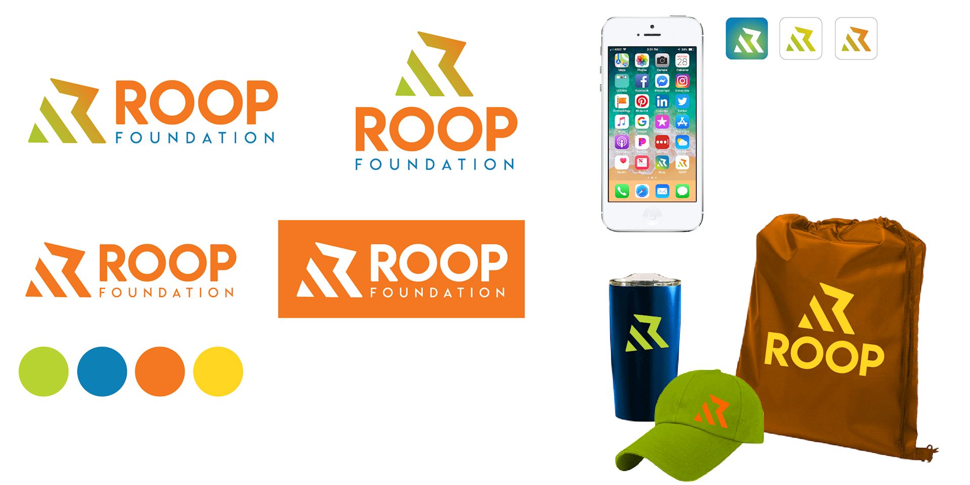
Color palette one is punchy bold and happy perfect for youth.
Color Palette 2
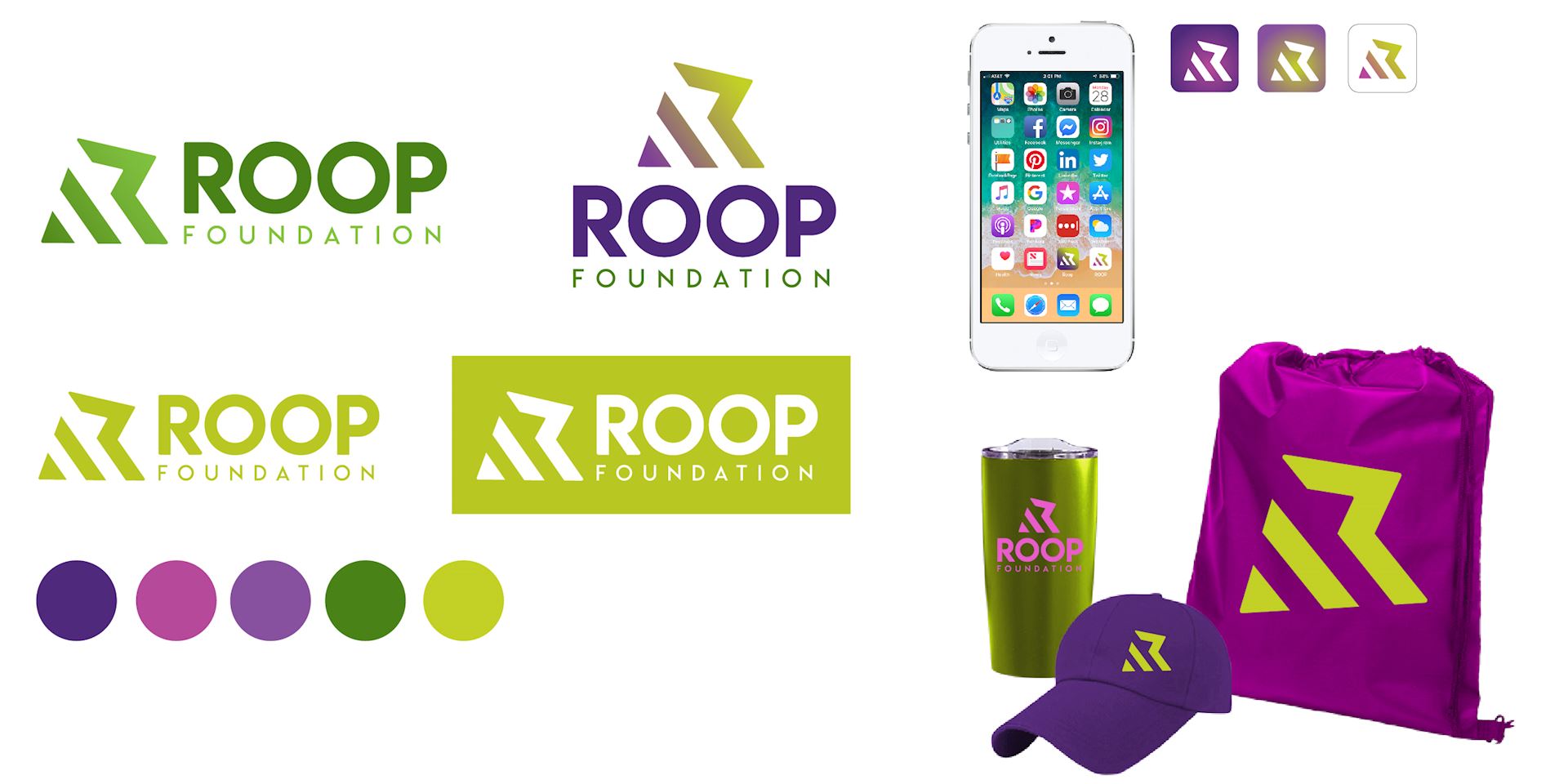
Purple, fuchsia and greens cater to both genders separately and when combined to create and fresh pairing. This palette is both youthful and professional.
Color Palette 3
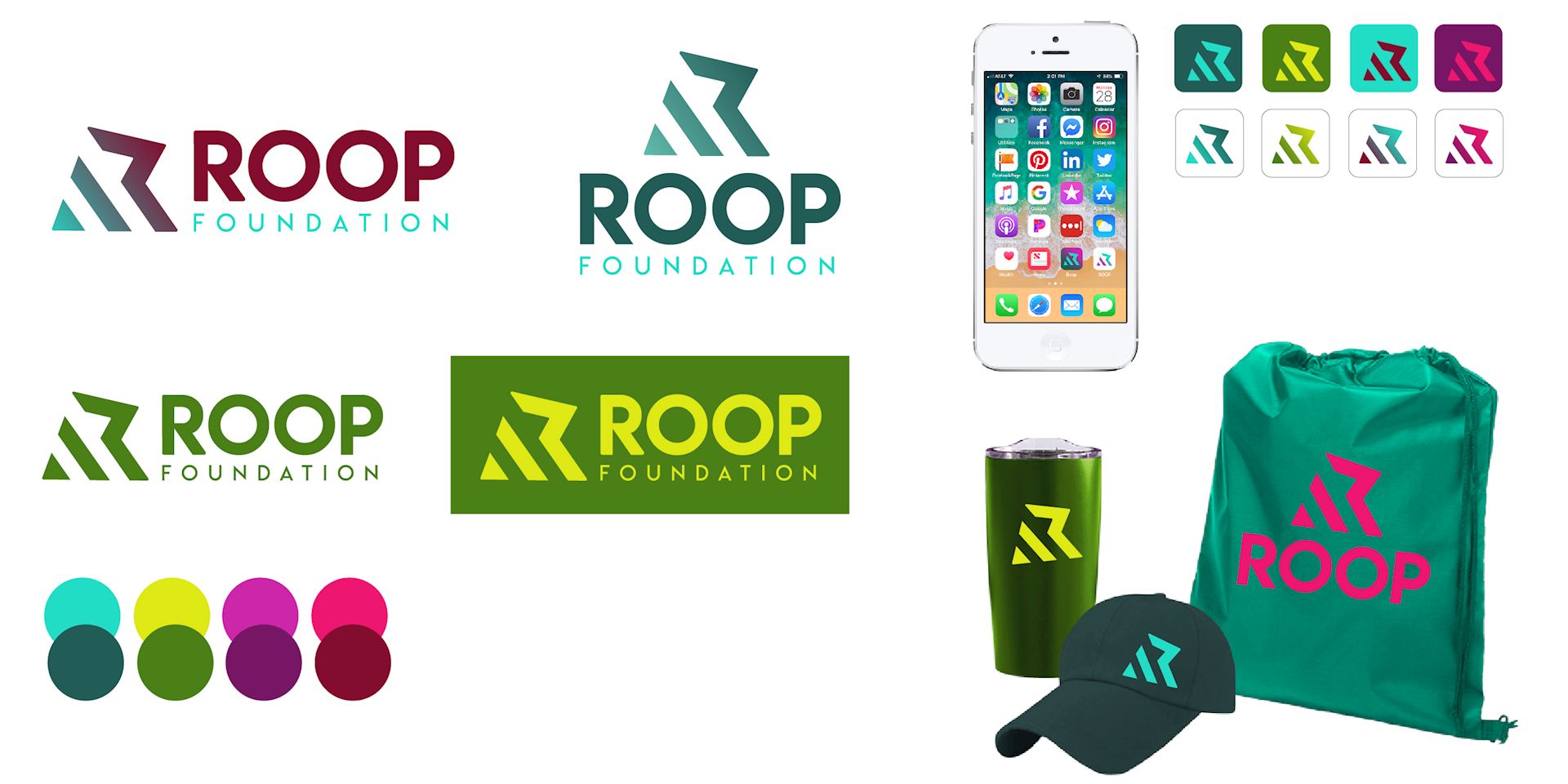
Teal, lime, fuchsia and purple. Another fresh and modern combination. It can look playful and professional depending on the combinations. We also looked at the lime being mint.
Color Palette 4
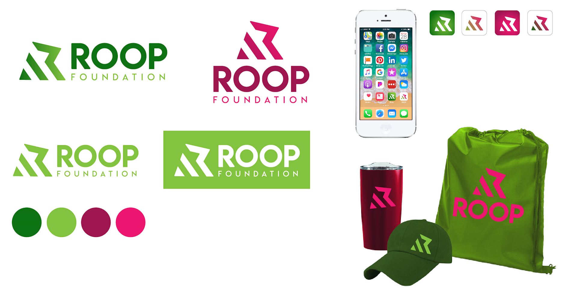
Watermelon green and pink make a unique and fresh color palette.
Final Logo Identity
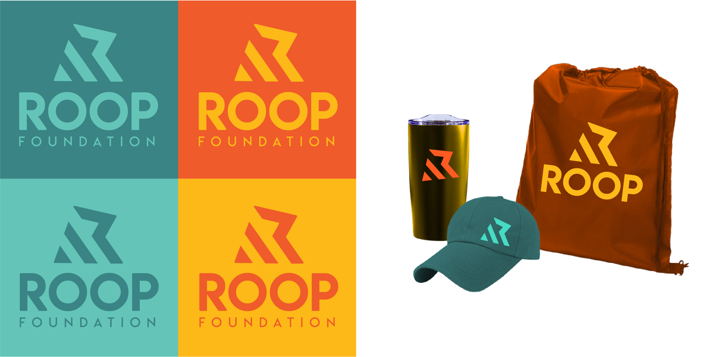
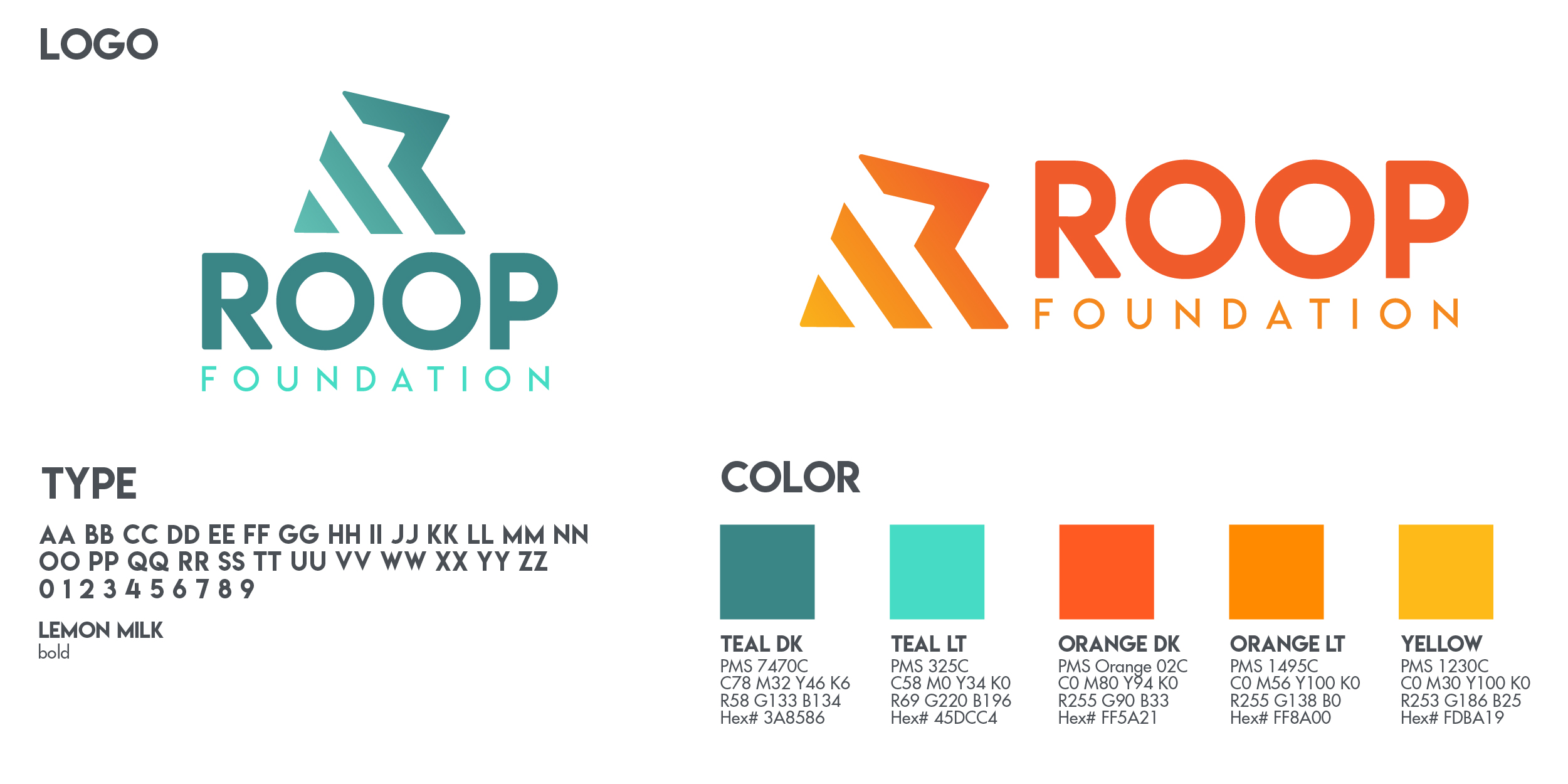
The client really liked the yellow and oranges from concept 1 and the teals from options 3 but Jordan Crown had a great idea and recommended them try a few options in website mockups to make sure Roop liked how they’d be used there before approving and finalizing. Roop Foundation picked sunrise colors which is fitting for their organization.
Final colors & swag
This color palette is bold and appeals to all ages. This was a great collaboration between Roop Foundation, Jordan Crown and myself. Go Team!
