Brief
About
Salal is a large credit union in Washington State with branches in First Hill, South Lake Union, Northgate, Bellevue, and Tukwila. With 70 years of experience, they have helped thousands of member manage their money. They offer four distinct lines of business – retail banking, small business services, mortgages, and dealer direct lending – which provide a wide range of deposit and loan products.
Project
My role was to work with the Salal marketing team to create a look and feel for two campaigns; Checking and Balance Transfer Promotions that would run simultaneously. I was to use the brand guidelines, previous campaigns, copy and creativity to create two winter promotions.
Brand Guidelines
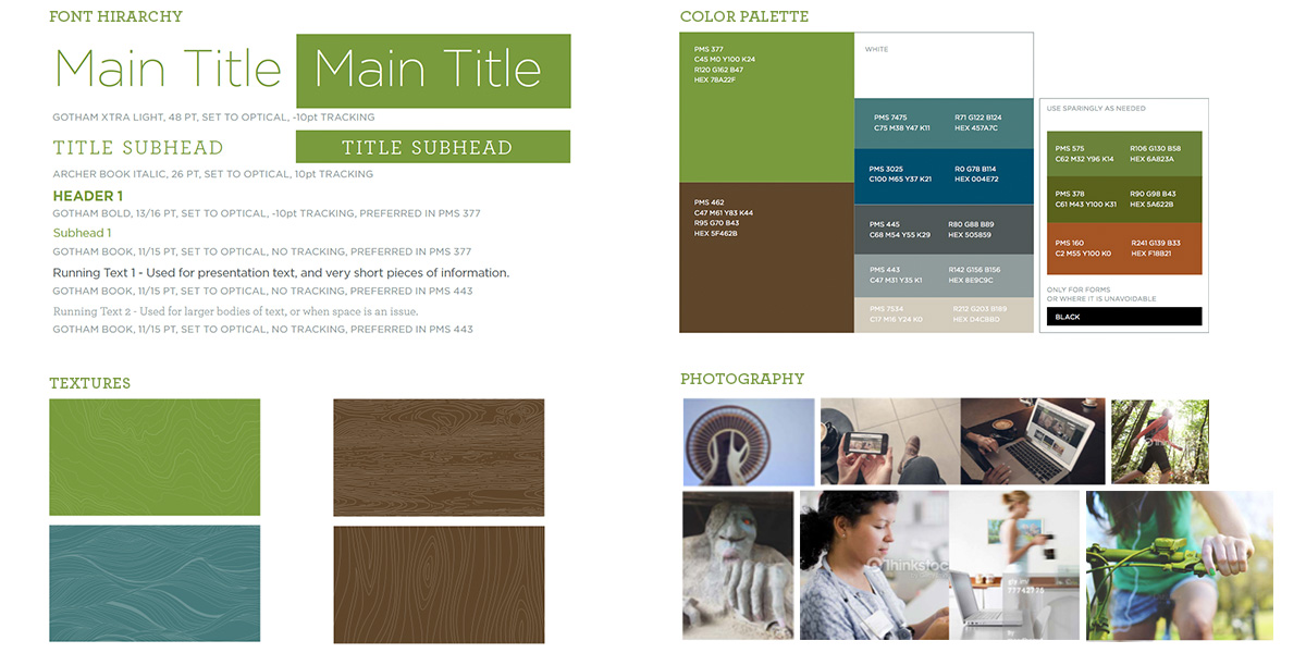
I was given font hierarchy, color, textures and photography guidelines.
.
Round 1 – Checking
As a good art director, I read the guidelines and try to push them in round one. Sometimes clients are interested in an out-of-the box perspective on them and are ready to evolve their brand. This wasn’t their case but they appreciated how I expanded upon the brand, its colors, textures and fonts to create beautiful compositions.

Round 2 – Checking
Salal picked an image from round 1 and asked to see more as well as go back to the brand typography hierarchy, core colors and woodgrain texture.

Checking promotion – Print
After nailing the poster design and copy, I worked on the rest of the print material including postcards, flyers and teller signs.

Checking promotion – Digital
This campaign had a strong digital plan too. Collateral included digital banners and ads, a newsletter driving to a landing page.

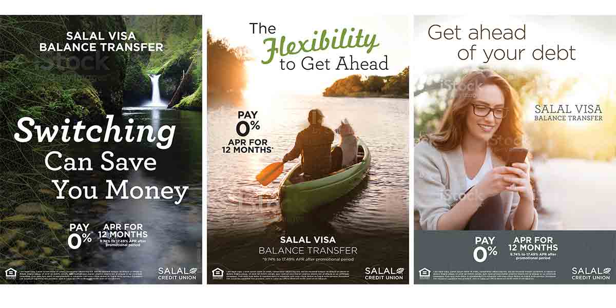
Round 1 – Balance Transfer
As a good art director, I read the guidelines and try to push them in round one. Sometimes clients are interested in an out-of-the box perspective on them and are ready to evolve their brand. This wasn’t their case but they appreciated how I expanded upon the brand, its colors, textures and fonts to create beautiful compositions.
Round 2 – Balance Transfer
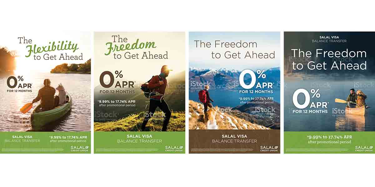
Salal picked a main image from round 1 and a few from the image options I had provided. They asked me to follow more closely the brand typography hierarchy, core colors and woodgrain texture.
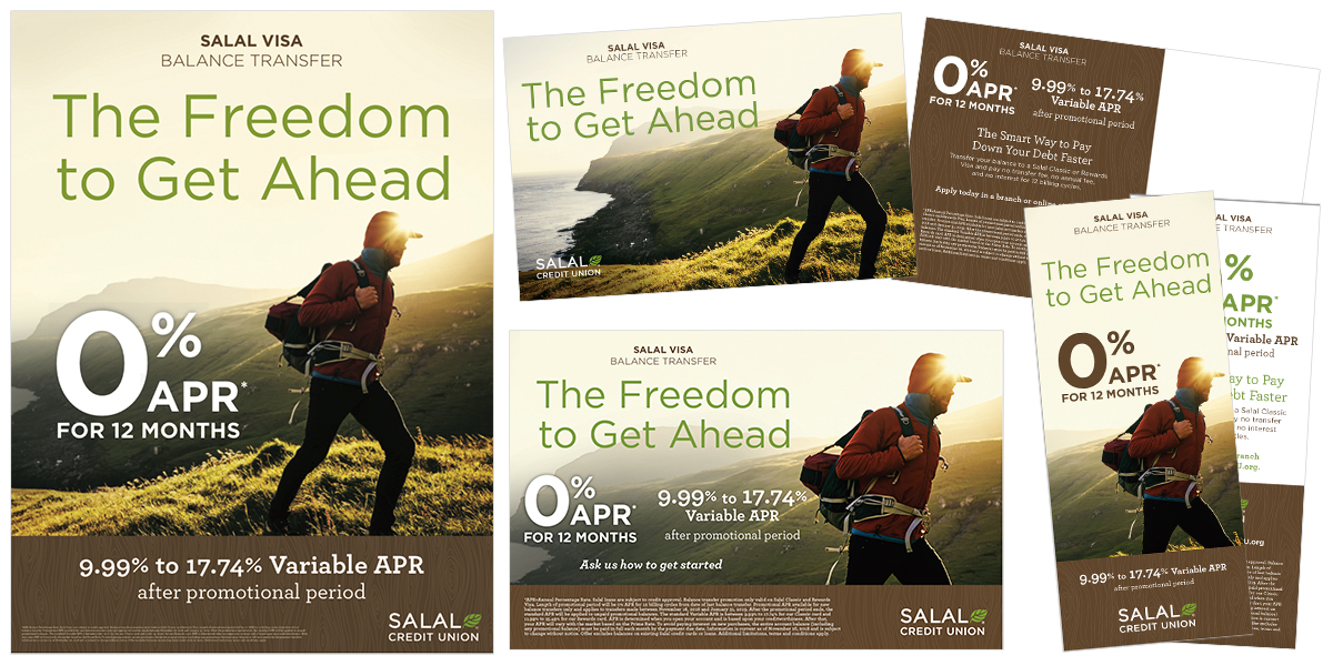
Balance Transfer – Print
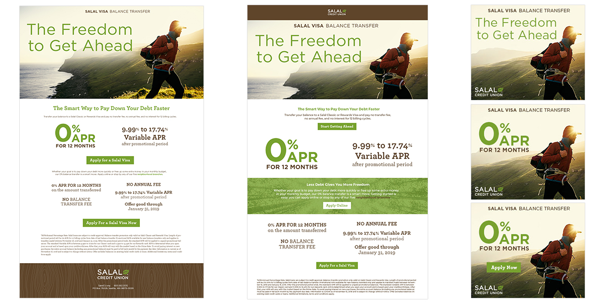
Once the client approved the layout and copy for the poster we flushed it to the other pieces of collateral including flyers, postcards and teller signs.
Balance Transfer – Digital
Salal used paid ads, digital banners and newsletters to drive traffic to their landing page. The goal of the balance transfer campaign is to get users to consolidate their credit debts.
